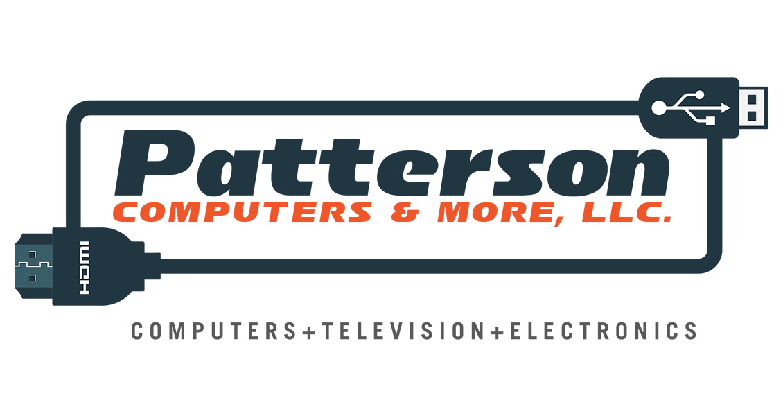
Patterson Computers & More
Project details
Long-time friend and a former manager of mine Donald Patterson was in need of a logo refresh for his thriving computer, television and electronics repair shop.
His previous logo was mostly just one color, modest typography but no real personality. We went through a few iterations but the final product is very close to the very first concept I crafted.
Since the original logo had a cable running through it I wanted to incorporate that into the new logo but also add a bit of style and purpose. Both the USB and HDMI cables were handcrafted and the font was slightly tweaked to feel broad and bold while the lowercase characters helps maintain a certain ease and approachability (if you haven't noticed many of today's most popular logos use lowercase characters; e.g. Facebook, Twitter, Instagram, eBay, Amazon, even Walmart's new mostly font-based logo which was once stocky, bold, capital letters now uses lowercase characters; here's a short article about the psychology of using lowercase characters The Case for Lowercase).